JS+CSS實現過渡特效
最近在玩一個叫Baba is you的遊戲,很羨慕裡面的一個轉場特效,所以試著做瞭一下。主要使用瞭JS和CSS,特效主要是用CSS實現的。

HTML代碼
<!DOCTYPE html>
<html lang="en" dir="ltr">
<head>
<meta charset="utf-8">
<title>開始導航</title>
<link rel="stylesheet" href="style.css" >
</head>
<body>
<div class="text">
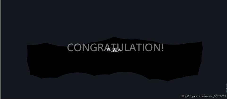
<p><a id="bottom">點擊進入</a></p>
</div>
</body>
<script type="text/javascript">
//執行代碼
window.onload=function(){
var bottom=document.getElementById("bottom");
bottom.onclick=function(){
action();
}
}
//獲取網頁長寬
var windowWidth=window.screen.width;
var windowHeight=window.screen.height;
function createSnow(){
topblack();
leftblack();
bottomblack();
rightblack();
function topblack(){
//隨機創造1個div圓球
var left_random=Math.random()*windowWidth;
var top_random=Math.random()*50;
var div=document.createElement('div');
div.className='snow';
//定義縮放轉換
div.style.transform='scale('+(Math.random()*3)+')'
//定義隨機位置,在頂部50像素之內
div.style.left=left_random+'px';
div.style.top=top_random+'px';
//放在html外面,先用overflow:hidden隱藏掉
div.style.marginTop="-250px";
document.body.appendChild(div);
}
function leftblack(){
var left_random=Math.random()*50;
var top_random=Math.random()* windowHeight;
var div=document.createElement('div');
div.className='snow';
div.style.transform='scale('+(Math.random()*2)+')'
div.style.left= left_random+'px';
div.style.top=top_random+'px';
div.style.marginLeft="-250px";
document.body.appendChild(div);
}
function bottomblack(){
var left_random=Math.random()*windowWidth;
var bottom_random=Math.random()*50;
var div=document.createElement('div');
div.className='snow';
div.style.transform='scale('+(Math.random()*2)+')'
div.style.left=left_random+'px';
div.style.bottom=bottom_random+'px';
div.style.marginBottom="-250px";
document.body.appendChild(div);
}
function rightblack(){
var right_random=Math.random()*50;
var top_random=Math.random()* windowHeight;
var div=document.createElement('div');
div.className='snow';
div.style.transform='scale('+(Math.random()*2)+')'
div.style.right=right_random+'px';
div.style.top=top_random+'px';
div.style.marginRight="-250px";
document.body.appendChild(div);
}
}
function setblack(){
//各自創造100個圓球隨機放在HTML頂部、底部、左右邊,各自隱藏。
for(var i=0;i<100;i++){
createSnow()
}
}
//清除使用過後的雲層與文字
function clearsnow(){
var snow=document.querySelectorAll(".snow");
var font=document.querySelector(".Fontarea");
for(var i=0;i<snow.length;i++){
document.body.removeChild(snow[i]);
}
document.body.removeChild(font);
}
//隻是一個習慣,定義一個創建div的模板函數。你們可以用自己的方式。
function font(oCss){
var oBox=document.createElement("p");
oCss.parent.appendChild(oBox);
oBox.innerHTML=oCss.p;
oBox.className=oCss.c;
return oBox;
}
function create(oCss){
var oBox=document.createElement("div");
oCss.parent.appendChild(oBox);
oBox.style.width=oCss.w+"px";
oBox.style.height=oCss.h+"px";
oBox.style.position=oCss.p;
oBox.style.left=oCss.l+"px";
oBox.style.top=oCss.t+"px";
oBox.style.backgroundSize="100%";
return oBox;
}
//創建浮現的文字
function winthegame(){
var Fontarea=create({
"w":500,
"h":600,
"p":"absolute",
"parent":document.body,
"l":"400",
"t":"0"});
Fontarea.style.marginTop="200px";
Fontarea.className="Fontarea";
Fontarea.style.zIndex="31";
var titlep=font({ "parent":Fontarea,"p":"CONGRATULATION!","c":"font7"});
}
//執行創建雲層與文字,封裝起來是因為,如果文字出現多個不同的,就用不同的函數封裝不同的場合。
function wintime(){
winthegame();
setblack();
}
//執行創建與清除,用setTimeout()來延遲清除。
function action(){
wintime();
setTimeout(clearsnow,5000);
}
</script>
</html>
css代碼
body{
 background-size: 100%;
 overflow: hidden;
 background-color: #000;
}
.text{
 color: white;
 text-align: center;
 text-transform: uppercase;
 margin: 300px 0;
 font-size: 22px;
}
.text a{color:white;
 text-decoration:none;
 cursor: pointer;
  }
.snow{
 background: #15181f;
 position: absolute;
 width: 100px;
 height: 100px;
 border-radius: 50%;
 z-index: 30;
 animation: bganimation 5s 1;
}
.font7{
 color:white;
 text-align: center;
 font-size: 60px;
}
.Fontarea{
 opacity:0;
 animation: beganfont 4s 1;
}
@keyframes bganimation {
 0%{
 width: 100px;
 height: 100px;
 }
 50%{
 width: 500px;
 height: 500px;
 }
 100%{
 width: 100px;
 height: 100px;
 }
}
@keyframes beganfont {
 0%{
 opacity:0;
 }
 50%{
 opacity:1;
 }
 100%{
 opacity:0;
 }
}
這是效果圖,點擊文字會執行效果一次。
效果JS的解析都寫在註釋裡瞭,CSS就是使用@keyframes來實現效果,也不是什麼難懂的。
這種效果對於用於展示開場應該足夠瞭,主要可以用來炫耀之類的,JS的代碼或許比較粗糙,是從某個朋友的雪花特效那copy來改的。主要是用來做一個期末項目的,這個項目某些東西我以後也會慢慢總結的。
那麼,就這樣,可能我寫的特效會跟別人的撞車,請多多包涵。如果感覺不是什麼高大上的東西,也請多多包涵。
以上就是本文的全部內容,希望對大傢的學習有所幫助,也希望大傢多多支持WalkonNet。