Python中seaborn庫之countplot的數據可視化使用
在Python數據可視化中,seaborn較好的提供瞭圖形的一些可視化功效。
seaborn官方文檔見鏈接:http://seaborn.pydata.org/api.html
countplot是seaborn庫中分類圖的一種,作用是使用條形顯示每個分箱器中的觀察計數。接下來,對seaborn中的countplot方法進行詳細的一個講解,希望可以幫助到剛入門的同行。
導入seaborn庫
import seaborn as sns
使用countplot
sns.countplot()
countplot方法中必須要x或者y參數,不然就報錯。
官方給出的countplot方法及參數:
sns.countplot(x=None, y=None, hue=None, data=None, order=None, hue_order=None, orient=None, color=None, palette=None, saturation=0.75, dodge=True, ax=None, **kwargs)
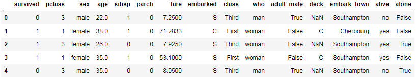
下面講解countplot方法中的每一個參數。以泰坦尼克號為例。
原始數據如下:
sns.set(style='darkgrid')
titanic = sns.load_dataset('titanic')
titanic.head()
x, y, hue : names of variables in “data“ or vector data, optional. Inputs for plotting long-form data. See examples for interpretation.
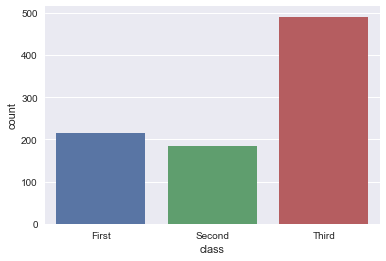
第一種方式
x: x軸上的條形圖,以x標簽劃分統計個數
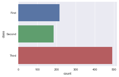
y: y軸上的條形圖,以y標簽劃分統計個數
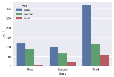
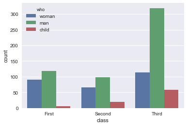
hue: 在x或y標簽劃分的同時,再以hue標簽劃分統計個數
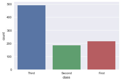
sns.countplot(x="class", data=titanic)
sns.countplot(y="class", data=titanic)

sns.countplot(x="class", hue="who", data=titanic)
第二種方法
x: x軸上的條形圖,直接為series數據
y: y軸上的條形圖,直接為series數據
sns.countplot(x=titanic['class'])

sns.countplot(y=titanic['class'])
data : DataFrame, array, or list of arrays, optional. Dataset for plotting.
If “x“ and “y“ are absent, this is interpreted as wide-form. Otherwise it is expected to be long-form.
data: DataFrame或array或array列表,用於繪圖的數據集,x或y缺失時,data參數為數據集,同時x或y不可缺少,必須要有其中一個。
sns.countplot(x='class', data=titanic)

order, hue_order : lists of strings, optional.Order to plot the categorical levels in, otherwise the levels are inferred from the data objects.
order, hue_order分別是對x或y的字段排序,hue的字段排序。排序的方式為列表。
sns.countplot(x='class', data=titanic, order=['Third', 'Second', 'First'])
sns.countplot(x='class', hue='who', data=titanic, hue_order=['woman', 'man', 'child'])
orient : “v” | “h”, optional
Orientation of the plot (vertical or horizontal). This is usually
inferred from the dtype of the input variables, but can be used to
specify when the “categorical” variable is a numeric or when plotting
wide-form data.
強制定向,v:豎直方向;h:水平方向,具體實例未知。
color : matplotlib color, optional
Color for all of the elements, or seed for a gradient palette.
palette : palette name, list, or dict, optional.Colors to use for the different levels of the “hue“ variable.
Should be something that can be interpreted by :func:`color_palette`, or a dictionary mapping hue levels to matplotlib colors.
palette:使用不同的調色板
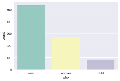
sns.countplot(x="who", data=titanic, palette="Set3")
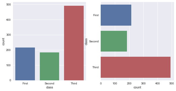
ax : matplotlib Axes, optional
Axes object to draw the plot onto, otherwise uses the current Axes.
ax用來指定坐標系。
fig, ax = plt.subplots(1, 2, figsize=(10, 5))
sns.countplot(x='class', data=titanic, ax=ax[0])
sns.countplot(y='class', data=titanic, ax=ax[1])
到此這篇關於Python中seaborn庫之countplot的數據可視化使用的文章就介紹到這瞭,更多相關Python seaborn庫countplot內容請搜索WalkonNet以前的文章或繼續瀏覽下面的相關文章希望大傢以後多多支持WalkonNet!
推薦閱讀:
- python sns.countplot() 繪畫條形圖詳情
- Python可視化學習之seaborn調色盤
- python可視化分析的實現(matplotlib、seaborn、ggplot2)
- Python 制作子彈圖
- 詳解Python中matplotlib模塊的繪圖方式