利用python做數據擬合詳情
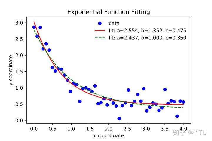
1、例子:擬合一種函數Func,此處為一個指數函數。
出處:
SciPy v1.1.0 Reference Guide
#Header
import numpy as np
import matplotlib.pyplot as plt
from scipy.optimize import curve_fit

#Define a function(here a exponential function is used)
def func(x, a, b, c):
 return a * np.exp(-b * x) + c

#Create the data to be fit with some noise
xdata = np.linspace(0, 4, 50)
y = func(xdata, 2.5, 1.3, 0.5)
np.random.seed(1729)
y_noise = 0.2 * np.random.normal(size=xdata.size)
ydata = y + y_noise
plt.plot(xdata, ydata, 'bo', label='data')

#Fit for the parameters a, b, c of the function func:
popt, pcov = curve_fit(func, xdata, ydata)
popt #output: array([ 2.55423706, 1.35190947, 0.47450618])
plt.plot(xdata, func(xdata, *popt), 'r-',
 label='fit: a=%5.3f, b=%5.3f, c=%5.3f' % tuple(popt))

#In the case of parameters a,b,c need be constrainted
#Constrain the optimization to the region of
#0 <= a <= 3, 0 <= b <= 1 and 0 <= c <= 0.5
popt, pcov = curve_fit(func, xdata, ydata, bounds=(0, [3., 1., 0.5]))
popt #output: array([ 2.43708906, 1. , 0.35015434])
plt.plot(xdata, func(xdata, *popt), 'g--',
 label='fit: a=%5.3f, b=%5.3f, c=%5.3f' % tuple(popt))

#Labels
plt.title("Exponential Function Fitting")
plt.xlabel('x coordinate')
plt.ylabel('y coordinate')
plt.legend()
leg = plt.legend()  # remove the frame of Legend, personal choice
leg.get_frame().set_linewidth(0.0) # remove the frame of Legend, personal choice
#leg.get_frame().set_edgecolor('b') # change the color of Legend frame
#plt.show()

#Export figure
#plt.savefig('fit1.eps', format='eps', dpi=1000)
plt.savefig('fit1.pdf', format='pdf', dpi=1000, figsize=(8, 6), facecolor='w', edgecolor='k')
plt.savefig('fit1.jpg', format='jpg', dpi=1000, figsize=(8, 6), facecolor='w', edgecolor='k')
上面一段代碼可以直接在spyder中運行。得到的JPG導出圖如下:
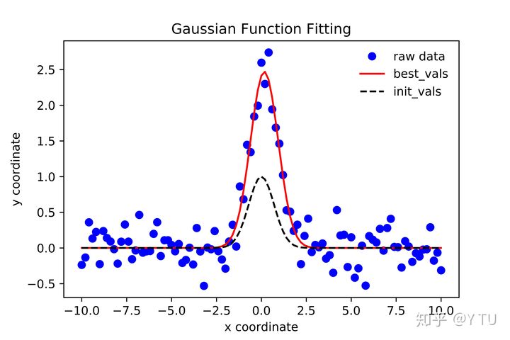
2. 例子:擬合一個Gaussian函數
出處:LMFIT: Non-Linear Least-Squares Minimization and Curve-Fitting for Python
#Header
import numpy as np
import matplotlib.pyplot as plt
from numpy import exp, linspace, random
from scipy.optimize import curve_fit

#Define the Gaussian function
def gaussian(x, amp, cen, wid):
 return amp * exp(-(x-cen)**2 / wid)

#Create the data to be fitted
x = linspace(-10, 10, 101)
y = gaussian(x, 2.33, 0.21, 1.51) + random.normal(0, 0.2, len(x))
np.savetxt ('data.dat',[x,y])  #[x,y] is is saved as a matrix of 2 lines

#Set the initial(init) values of parameters need to optimize(best)
init_vals = [1, 0, 1] # for [amp, cen, wid]

#Define the optimized values of parameters
best_vals, covar = curve_fit(gaussian, x, y, p0=init_vals)
print(best_vals) # output: array [2.27317256  0.20682276  1.64512305]

#Plot the curve with initial parameters and optimized parameters
y1 = gaussian(x, *best_vals) #best_vals, '*'is used to read-out the values in the array
y2 = gaussian(x, *init_vals) #init_vals
plt.plot(x, y, 'bo',label='raw data')
plt.plot(x, y1, 'r-',label='best_vals')
plt.plot(x, y2, 'k--',label='init_vals')
#plt.show()

#Labels
plt.title("Gaussian Function Fitting")
plt.xlabel('x coordinate')
plt.ylabel('y coordinate')
plt.legend()
leg = plt.legend()  # remove the frame of Legend, personal choice
leg.get_frame().set_linewidth(0.0) # remove the frame of Legend, personal choice
#leg.get_frame().set_edgecolor('b') # change the color of Legend frame
#plt.show()

#Export figure
#plt.savefig('fit2.eps', format='eps', dpi=1000)
plt.savefig('fit2.pdf', format='pdf', dpi=1000, figsize=(8, 6), facecolor='w', edgecolor='k')
plt.savefig('fit2.jpg', format='jpg', dpi=1000, figsize=(8, 6), facecolor='w', edgecolor='k')
上面一段代碼可以直接在spyder中運行。得到的JPG導出圖如下:
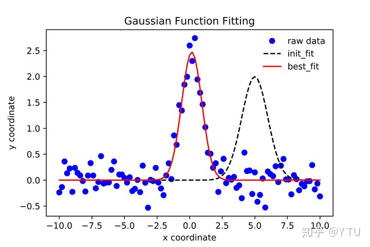
3. 用一個lmfit的包來實現2中的Gaussian函數擬合
需要下載lmfit這個包,下載地址:
https://pypi.org/project/lmfit/#files
下載下來的文件是.tar.gz格式,在MacOS及Linux命令行中解壓,指令:
將其中的lmfit文件夾復制到當前project目錄下。
上述例子2中生成瞭data.dat,用來作為接下來的方法中的原始數據。
出處:
Modeling Data and Curve Fitting
#Header
import numpy as np
import matplotlib.pyplot as plt
from numpy import exp, loadtxt, pi, sqrt
from lmfit import Model

#Import the data and define x, y and the function
data = loadtxt('data.dat')
x = data[0, :]
y = data[1, :]
def gaussian1(x, amp, cen, wid):
 return (amp / (sqrt(2*pi) * wid)) * exp(-(x-cen)**2 / (2*wid**2))

#Fitting
gmodel = Model(gaussian1)
result = gmodel.fit(y, x=x, amp=5, cen=5, wid=1) #Fit from initial values (5,5,1)
print(result.fit_report())

#Plot
plt.plot(x, y, 'bo',label='raw data')
plt.plot(x, result.init_fit, 'k--',label='init_fit')
plt.plot(x, result.best_fit, 'r-',label='best_fit')
#plt.show()


#Labels
plt.title("Gaussian Function Fitting")
plt.xlabel('x coordinate')
plt.ylabel('y coordinate')
plt.legend()
leg = plt.legend()  # remove the frame of Legend, personal choice
leg.get_frame().set_linewidth(0.0) # remove the frame of Legend, personal choice
#leg.get_frame().set_edgecolor('b') # change the color of Legend frame
#plt.show()

#Export figure
#plt.savefig('fit3.eps', format='eps', dpi=1000)
plt.savefig('fit3.pdf', format='pdf', dpi=1000, figsize=(8, 6), facecolor='w', edgecolor='k')
plt.savefig('fit3.jpg', format='jpg', dpi=1000, figsize=(8, 6), facecolor='w', edgecolor='k')
上面這一段代碼需要按指示下載lmfit包,並且讀取例子2中生成的data.dat。
得到的JPG導出圖如下:
到此這篇關於利用python做數據擬合詳情的文章就介紹到這瞭,更多相關python做數據擬合內容請搜索WalkonNet以前的文章或繼續瀏覽下面的相關文章希望大傢以後多多支持WalkonNet!
推薦閱讀:
- pytorch繪制曲線的方法
- python設置 matplotlib 正確顯示中文的四種方式
- Python Matplotlib繪制動圖平滑曲線
- Python數據分析應用之Matplotlib數據可視化詳情
- 如何利用Matplotlib庫繪制動畫及保存GIF圖片