python繪制堆疊條形圖介紹
目前在網絡上多是單個條形圖堆疊,沒看到一組的條形圖堆疊。
代碼如下:
import numpy as np
import pandas as pd
import matplotlib.pyplot as plt
import matplotlib.ticker as ticker
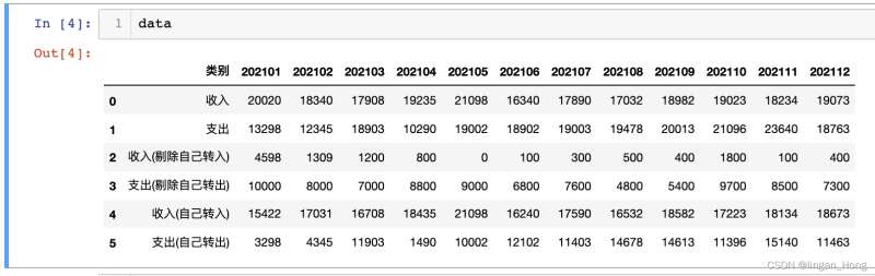
導入一組自己造的數據
data  = pd.read_excel('data.xlsx')
In [4]: data
Out[4]:
多使用幾個plt.bar()函數,就可以畫出來啦。。。
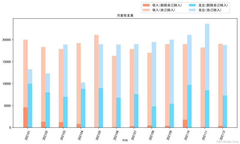
tick_label = list(data.columns)
tick_label.remove(‘類別')
x = np.arange(len(tick_label))

y1 = data.iloc[2,1:].values.tolist() #收入(剔除自己轉入)
y2 = data.iloc[3,1:].values.tolist() #支出(剔除自己轉入)
y3 = data.iloc[4,1:].values.tolist() #收入(自己轉入)
y4 = data.iloc[5,1:].values.tolist() #支出(自己轉入)
bar_with = 0.25 #柱體寬度plt.figure(figsize = (12,6)) #畫佈大小
plt.bar(x, y1, width = bar_with, #柱體寬度
align = ‘center', #x軸上的坐標與柱體對其的位置
color = ‘orangered', alpha = 0.6, #柱體透明度
label = ‘收入(剔除自己轉入)')
plt.bar(x,y3,width = bar_with, bottom = y1, #柱體基線的y軸坐標
align = ‘center', color = ‘lightsalmon', alpha = 0.6, label = ‘收入(自己轉入)')
plt.bar(x + bar_with, y2, width = bar_with,
align = ‘center', color = ‘deepskyblue', alpha = 0.6, label = ‘支出(剔除自己轉入)')
plt.bar(x + bar_with, y4, width = bar_with, bottom = y2,
align = ‘center', color = ‘lightskyblue', alpha = 0.6, label = ‘支出(自己轉入)')
plt.title(‘月度收支表', fontsize = 10) #設置x軸標題
plt.xticks(x + bar_with/2, tick_label, rotation = 70) #設置x軸坐標
plt.xlabel(‘時間',fontsize = 8, verticalalignment = ‘top', horizontalalignment=‘right',rotation=‘horizontal')
plt.xlabel(‘時間',fontsize = 8, verticalalignment = ‘bottom', horizontalalignment=‘center')

#圖例設在圖形外面,控制坐標參數
plt.legend(loc = ‘center', bbox_to_anchor = (0.77, 1.1), ncol=2)
plt.savefig(‘draw_bar.png', dpi=200, bbox_inches = ‘tight')
plt.close()
繪制如圖:
是不是其實plt繪圖也沒有哪麼辣眼睛瞭。。。
到此這篇關於python繪制堆疊條形圖介紹的文章就介紹到這瞭,更多相關python堆疊條形圖內容請搜索WalkonNet以前的文章或繼續瀏覽下面的相關文章希望大傢以後多多支持WalkonNet!
推薦閱讀:
- python畫圖時給圖中的點加標簽和plt.text的使用
- Python數據分析之使用matplotlib繪制折線圖、柱狀圖和柱線混合圖
- Python用 matplotlib 繪制柱狀圖
- Python幾種繪制時間線圖的方法
- python 繪制斜率圖進行對比分析