python數據寫入列表並導出折線圖

import csv

datas = [['商品名稱','周一銷售','周二銷售','周三銷售','周四銷售','周五銷售','周六銷售','周日銷售'],
         ['洗衣機', '2', '1', '2', '3','2','4','5'],
         ['冰箱', '1', '2', '3', '2', '4', '5', '4'],
         ['空調', '3', '4', '3', '4', '3', '6', '5']]
# '商品名稱','周一銷售','周二銷售' ,'周三銷售','周四銷售','周五銷售','周六銷售','周日銷售'
#'洗衣機', '2', '1', '2', '3','2','4','5'
#'冰箱', '1', '2', '3', '2', '4', '5', '4'
#'空調', '3', '4', '3', '4', '3', '6', '5'
#要改成你自己當前工程所在的路徑 且創建對應的文件
#['1', '2', '3', '2', '4', '5', '4'],
with open('D:/Users/admin/PycharmProjects/pythonProject/sale.csv', 'w', newline='') as csvfile:
    writer = csv.writer(csvfile)
    for row in datas:
        writer.writerow(row)
生成折線圖:

import matplotlib.pyplot as plt
import numpy as np
import matplotlib.pyplot as plt
plt.rcParams['font.sans-serif'] = ['SimHei'] # 顯示中文標簽
plt.rcParams['axes.unicode_minus'] = False # 這兩行需要手動設置
x,y=np.loadtxt("D:/Users/admin/PycharmProjects/pythonProject/example_csv.txt",
delimiter=",",
unpack=True)
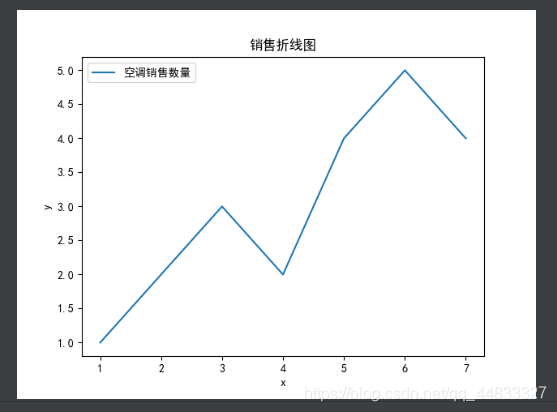
plt.plot(x,y,label="空調銷售數量")
plt.xlabel("x")
plt.ylabel("y")
plt.title("銷售折線圖")
plt.legend()
plt.show()
到此這篇關於python數據寫入列表並導出折線圖的文章就介紹到這瞭,更多相關python數據寫入列表並導出折線圖內容請搜索WalkonNet以前的文章或繼續瀏覽下面的相關文章希望大傢以後多多支持WalkonNet!
推薦閱讀:
- Python matplotlib實現圖表主題變換示例詳解
- python數據可視化之matplotlib.pyplot基礎以及折線圖
- python數學建模之Matplotlib 實現圖片繪制
- Python Matplotlib數據可視化模塊使用詳解
- Python 可視化matplotlib模塊基礎知識