Ant Design 組件庫之步驟條實現
引言
antd 組件庫是基於 Ant Design 設計體系的 React UI 組件庫,antd 為 Web 應用提供瞭豐富的基礎 UI 組件,可以用於研發企業級中後臺產品。這篇咱們介紹 antd 組件庫之 步驟條。
1 antd 之 Steps API
步驟條 Steps 的用處是在 當任務復雜或者存在先後關系時,將其分解成一系列的步驟,從而達到簡化任務的目的。其 DOM 節點為 :
<Steps>
  <Step>...</Step>
  <Step>...</Step>
  <Step>...</Step>
</Steps>
antd 中的步驟條樣式豐富,可以通過設置 Steps 和 Step 的屬性來產生不同的 步驟條 樣式,詳細的這裡我進行一個整理:
下面做一些實踐。
2 antd 之 Steps 示例
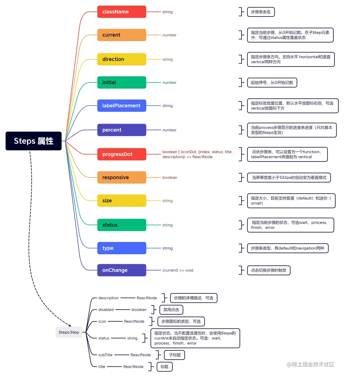
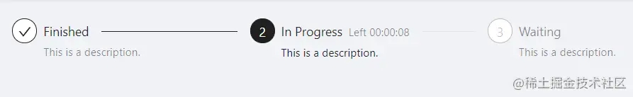
先來看最簡單的靜態的步驟條,看代碼:
import { Steps } from 'antd';
import React from 'react';
const { Step } = Steps;
const App = () => (
  <Steps current={1}>
    <Step title="Finished" description="This is a description." />
    <Step title="In Progress" subTitle="Left 00:00:08" description="This is a description." />
    <Step title="Waiting" description="This is a description." />
  </Steps>
);
export default App;
可以看到現在 current 默認選擇瞭 1,來看效果:
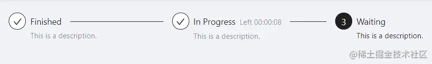
如果 current 我們選擇瞭 2, 那會是什麼樣子的呢:
再來看一個 帶圖標的步驟條,這裡用瞭 antd 的 icon,上代碼:
import { LoadingOutlined, SmileOutlined, SolutionOutlined, UserOutlined } from '@ant-design/icons';
import { Steps } from 'antd';
import React from 'react';
const { Step } = Steps;
const App = () => (
  <Steps>
    <Step status="finish" title="Login" icon={<UserOutlined />} />
    <Step status="finish" title="Verification" icon={<SolutionOutlined />} />
    <Step status="process" title="Pay" icon={<LoadingOutlined />} />
    <Step status="wait" title="Done" icon={<SmileOutlined />} />
  </Steps>
);
export default App;
來看效果:

來有意思一些的,看看動態的吧:配合按鈕進行步進或後退,來表示一個流程的處理進度,上代碼:
import { Button, message, Steps } from 'antd';
import React, { useState } from 'react';
const { Step } = Steps;
const steps = [
  {
    title: 'First',
    content: 'First-content',
  },
  {
    title: 'Second',
    content: 'Second-content',
  },
  {
    title: 'Last',
    content: 'Last-content',
  },
];
const App = () => {
  const [current, setCurrent] = useState(0);
  const next = () => {
    setCurrent(current + 1);
  };
  const prev = () => {
    setCurrent(current - 1);
  };
  return (
    <>
      <Steps current={current}>
        {steps.map((item) => (
          <Step key={item.title} title={item.title} />
        ))}
      </Steps>
      <div className="steps-content">{steps[current].content}</div>
      <div className="steps-action">
        {current < steps.length - 1 && (
          <Button type="primary" onClick={() => next()}>
            Next
          </Button>
        )}
        {current === steps.length - 1 && (
          <Button type="primary" onClick={() => message.success('Processing complete!')}>
            Done
          </Button>
        )}
        {current > 0 && (
          <Button
            style={{
              margin: '0 8px',
            }}
            onClick={() => prev()}
          >
            Previous
          </Button>
        )}
      </div>
    </>
  );
};
export default App;
還有 CSS 代碼,同級目錄下寫個 index.less:
.steps-content {
    min-height: 200px;
    margin-top: 16px;
    padding-top: 80px;
    text-align: center;
    background-color: #fafafa;
    border: 1px dashed #e9e9e9;
    border-radius: 2px;
  }
  .steps-action {
    margin-top: 24px;
  }
來看效果:

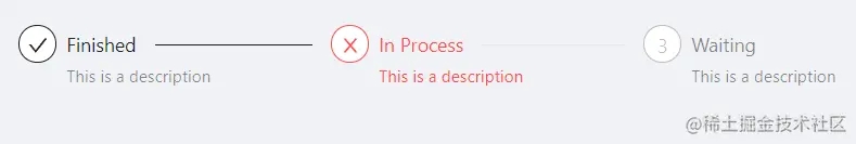
步驟條還可以通過 Steps 的 status 屬性來指定當前步驟的狀態,來看示例:
import { Steps } from 'antd';
import React from 'react';
const { Step } = Steps;
const App = () => (
  <Steps current={1} status="error">
    <Step title="Finished" description="This is a description" />
    <Step title="In Process" description="This is a description" />
    <Step title="Waiting" description="This is a description" />
  </Steps>
);
export default App;
來看效果,這裡是第 1 步出現 err 瞭:
咱們也可以給步驟條的每個步驟添加自定義的展示,上代碼:
import { Popover, Steps } from 'antd';
import React from 'react';
const { Step } = Steps;
const customDot = (dot, { status, index }) => (
  <Popover
    content={
      <span>
        step {index} status: {status}
      </span>
    }
  >
    {dot}
  </Popover>
);
const App = () => (
  <Steps current={1} progressDot={customDot}>
    <Step title="Finished" description="You can hover on the dot." />
    <Step title="In Progress" description="You can hover on the dot." />
    <Step title="Waiting" description="You can hover on the dot." />
    <Step title="Waiting" description="You can hover on the dot." />
  </Steps>
);
export default App;
來看效果:

最後來看一個 Steps 中的 Step 可點擊的步驟條,上代碼:
import { Divider, Steps } from 'antd';
import React, { useState } from 'react';
const { Step } = Steps;
const App = () => {
  const [current, setCurrent] = useState(0);
  const onChange = (value) => {
    console.log('onChange:', current);
    setCurrent(value);
  };
  return (
    <>
      <Steps current={current} onChange={onChange}>
        <Step title="Step 1" description="This is a description." />
        <Step title="Step 2" description="This is a description." />
        <Step title="Step 3" description="This is a description." />
      </Steps>
      <Divider />
      <Steps current={current} onChange={onChange} direction="vertical">
        <Step title="Step 1" description="This is a description." />
        <Step title="Step 2" description="This is a description." />
        <Step title="Step 3" description="This is a description." />
      </Steps>
    </>
  );
};
export default App;
從上面的代碼可以看到,當你點擊 change Steps 的時候,會觸發 onChange 回調函數,咱們這裡的 onChange 隻做瞭兩件事情:
(1) 控制臺打印 current,current 大傢應該熟悉,就是第幾個 Step;
(2) 設置 setCurrent。這個地方不限於此,盡可以發揮想象。
來看效果:

好瞭,以上分享瞭 Ant Design 組件庫之步驟條。
更多關於Ant Design 組件庫步驟條的資料請關註WalkonNet其它相關文章!
推薦閱讀:
- Ant Design 組件庫按鈕實現示例詳解
- React將組件作為參數進行傳遞的3種方法實例
- React UI組件庫之快速實現antd的按需引入和自定義主題
- antd+react中upload手動上傳單限制上傳一張
- React中父組件如何獲取子組件的值或方法