微信小程序自定義膠囊樣式
本文實例為大傢分享瞭微信小程序自定義左上角膠囊樣式的具體代碼,供大傢參考,具體內容如下
1、 將app.js 中的 window 對象屬性navigationStyle 改為自定義
"window": {
 "navigationStyle": "custom"
 },
改完之後的效果:

2、獲取 右上角膠囊的定位信息 設置

調用 wx.getMenuButtonBoundingClientRect() 函數得到右上角膠囊定位信息

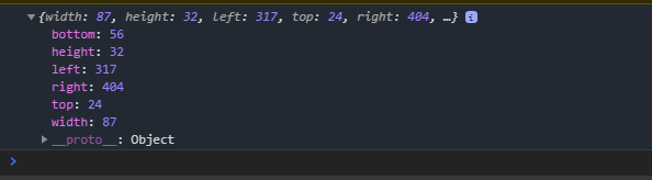
所需要的 屬性有 : top,height屬性,用於計算自定義左上角膠囊定位的位置
拿到 右上角膠囊的 top和height 相加得到 屏幕導航欄的固定高度:

在 data函數中聲明一個導航欄高度屬性,和一個 膠囊具體定位的top屬性:
賦值導航欄的高度 數據:
// pages/testQ/index.js
Page({

 /**
 * 頁面的初始數據
 */
 data: {
 navHeight:0,
 capsuleTop: 0

 },

 /**
 * 生命周期函數--監聽頁面加載
 */
 onLoad: function (options) {

 },

 /**
 * 生命周期函數--監聽頁面初次渲染完成
 */
 onReady: function () {

 },

 /**
 * 生命周期函數--監聽頁面顯示
 */
 onShow: function () {
 let dwObj = wx.getMenuButtonBoundingClientRect()
 let navHeight_ = (dwObj.top + dwObj.height)
 let capsuleTop_ = dwObj.top
 this.setData(
 {
 navHeight: navHeight_,
 capsuleTop:capsuleTop_

 }
 )
 },

 /**
 * 生命周期函數--監聽頁面隱藏
 */
 onHide: function () {

 },

 /**
 * 生命周期函數--監聽頁面卸載
 */
 onUnload: function () {

 },

 /**
 * 頁面相關事件處理函數--監聽用戶下拉動作
 */
 onPullDownRefresh: function () {

 },

 /**
 * 頁面上拉觸底事件的處理函數
 */
 onReachBottom: function () {

 },

 /**
 * 用戶點擊右上角分享
 */
 onShareAppMessage: function () {

 }
})
在 wxml 中定義 導航欄:
<!--pages/testQ/index.wxml-->

<!-- 左上角膠囊開始-->
<!--left-capsule 是最上層,可以設置背景-->
<view class="left-capsule">
 <!--left-capsule-nav 是用於定位左上角的位置-->
 <view class="left-capsule-nav" style="height:{{navHeight}}px;">
 <!--left-capsule-nav-content 是 膠囊主要內容-->
 <view style="position:relative;top:{{capsuleTop}}px;" class="left-capsule-nav-content">
 <!--back 膠囊 返回按鈕-->
 <view class="back">
 <!-- 我這個圖標引入的是 vant庫的icon,如果不是使用vant的話 得自定義一個icon-->
 <van-icon name="arrow-left" color="white" size="20"/>
 </view>
 <!-- line 膠囊 中間線條-->
 <view class="line"></view>
 <!-- home 膠囊 返回首頁按鈕-->
 <view class="home">
 <!-- 我這個圖標引入的是 vant庫的icon,如果不是使用vant的話 得自定義一個icon-->
 <van-icon name="wap-home-o" color="white" size="20"/>
 </view>
 </view>
 </view>
 <!-- 以上 可以 封裝成自定義組件,在引入,這個地方是 膠囊外的內容-->
 <view class="main-content" style="top:{{navHeight}}px;">
 我是測試左上角膠囊
</view>
<!-- 左上角膠囊結束-->
</view>
wxss內容:
/* 導航欄css開始*/
.left-capsule{
 width: 100vh;
 height: 100vh;
 background-color: black;
}
.left-capsule .left-capsule-nav{
 width: 100%;
 position: fixed;
 z-index: 2;
}
.left-capsule-nav .left-capsule-nav-content{
 width: 85px;
 text-align: center;
 border-radius: 50px;
 position: relative;
 top: 26px;
 left: 20px;
 box-shadow:0px 0px 1px 0.2px white;
 background-color: #1d19195c;
 height: 30px;
}
.left-capsule-nav-content view{
 display: inline;
 width: 35px;
 position: relative;
}
.left-capsule-nav-content .back{
 top: 4px;left: -5px;
}
.left-capsule-nav-content .line{
 top: 3px;
 width: 1px;
 border-left: solid #cac3c3 thin;
 height: 17px;
 display: inline-block;
}
.left-capsule-nav-content .home{
 top: 4px;
}
/* 導航欄css結束*/
/* 內容*/
.main-content{
 background-color: red;
 position: absolute;
 width: 100%;
 z-index: 1;

}
效果圖:

如果覺得紅色地方太挨得進的話 top 在加大一點
以上就是本文的全部內容,希望對大傢的學習有所幫助,也希望大傢多多支持WalkonNet。