Vue3實現Message消息組件示例
在大多數 web 產品中,全局的 Message 組件占有較大的使用場景,它常出現在給與用戶反饋、信息提示和與系統的對話場景中。如果使用傳統的組件寫法,則需要引入組件並在 components 中註冊,然後再去模板中以標簽的形式調用,傳入自定義 props 屬性並通過 emit 觸發事件,這類的組件往往有以下缺點:
- 需要頻繁引入並註冊
- 需要在模板中以標簽的形式使用組件
- 需要額外的參數控制組件的屬性和狀態
- 不能友好的自定義組件的掛載位置,會被其他組件影響
因此對於 Message 這類的組件,我們希望可以在 JavaScript 中調用,可以傳入自定義參數控制組件狀態,並且無需在調用的時候手動掛載組件到 body 尾部。如果你使用過主流第三方庫,例如 ElementUI plus 或 Ant Design for Vue, 那麼你肯定熟悉他們的消息組件 API,接下來就一起用 Vue3 實現一個全局的 Message 組件吧。
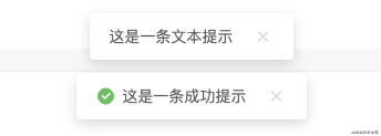
組件最終實現效果
組件設計
定義最終的組件 API
實現一個簡易的 Message 消息組件,包含類型 API 有文本(text)、成功(success)、失敗(error),即支持直接傳入一段文本,也支持通過組件具體的 option 配置,來自定義消息內容、關閉延遲、以及是否展示關閉按鈕等功能。
// Message 類型(type):文本、成功、失敗
["text", "success", "error"]

// Message 選項(option)
[String]: 消息內容
[Object]: 消息配置

// option 配置
text [String] "" 消息內容
duration [Number] 0 自動關閉延遲毫秒數,0為不自動關閉
close [Boolean] false 是否展示關閉按鈕

// 調用方式
Message[type](option);
調用示例
Message.text("這是一條消息提示");
Message.error({
    text: "網絡錯誤,請稍後再試",
    duration: 3000,
    close: true
});
定義組件結構
建立 Message 文件夾存儲組件的整體結構,其中 src 中包含組件的模板、樣式和實例文件,同級下,建立 index.js 將整個組件暴露出去,以便在項目和業務組件中引入。
|--- Message
 |--- src
 | |--- Message.vue // 組件模板
 | |--- Message.less // 提供組件樣式支持
 | |--- Message.js // 讀取配置並渲染組件實例
 | |--- Instance.js // 組件實例
 |---index.js // 暴露組件
模板和樣式
模板 Template
模板相對來說比較簡單,外層由動畫組件包裹,通過 v-show 去控制消息顯示和關閉,內容部分包括圖標、消息文本、以及可配置的手動關閉按鈕。
<template>
  <!-- 消息列表 -->
  <transition name="slide-fade">
    <div class="message-container" v-show="visibled">
      <!-- 內容 -->
      <div class="message-content">

        <!-- 消息類型圖標,通過消息類型確定,text類型不配置圖標 -->
        <div class="message-icon" v-if="config.icon">
          <i :class="config.icon"></i>
        </div>

  <!-- 消息文本 -->
        <span v-text="config.content"></span>

        <!-- 手動關閉消息 -->
        <div class="option" v-if="!config.close">
          <i class="ri-close-fill" @click="onClose"></i>
        </div>

      </div>
    </div>
  </transition>
</template>
消息圖標
需要註意的是,圖標是由調用 API 中的類型確定,在創建實例的時候確定圖標類型,這裡引用的是開源圖標庫 Remix Icon,具體的引用方法這裡不多贅述,地址:remixicon.cn/
樣式
在 Message.less 中定義樣式和動畫。
@radius: 4px;
@normalHeight: 34px;

.message {
  position: fixed;
  top: 0;
  left: 0;
  width: 100%;
  text-align: center;
  box-sizing: border-box;
  z-index: 9999;
  transform: translateZ(9999px);
  padding-top: 28px;
  transition: top .4s ease;

  .message-container {
    margin-bottom: 14px;

    .message-icon {
      display: inline-block;

      i {
        font-size: 18px;
        font-weight: 400;
        margin-top: -3px;
        margin-right: 6px;
        display: inline-block;
        box-sizing: border-box;
        vertical-align: middle;
      }

      .ri-checkbox-circle-fill {
        color: #58c05b;
      }

      .ri-close-circle-fill {
        color: #fd4f4d;
      }

    .message-content {
      display: inline-block;
      padding: 4px 18px;
      height: @normalHeight;
      text-align: left;
      line-height: @normalHeight;
      font-size: 14px;
      font-weight: 400;
      border-radius: @radius;
      color: #595959;
      box-shadow: 0 4px 12px rgba(0, 0, 0, .15);
      background: #ffffff;

      .option {
        display: inline-block;
        pointer-events: all;
        margin-left: 18px;

        i {
          font-size: 18px;
          font-weight: 400;
          margin-top: -3px;
          display: inline-block;
          box-sizing: border-box;
          vertical-align: middle;
          cursor: pointer;
          color: #d9d9d9;
          transition: color 0.2s ease;

          &:hover {
            color: #ff7c75;
            transition: color 0.2s ease;
          }
        }
      }
    }
  }

  .slide-fade-enter-active {
    transition: all .2s ease-out;
  }

  .slide-fade-leave-active {
    transition: all .2s ease;
  }

  .slide-fade-enter-from,
  .slide-fade-leave-to {
    transform: translateY(-20px);
    opacity: 0;
  }
}
組件腳本
組件中通過獲取傳入的config配置和remove實現渲染和取消掛載,通過onOpen和onClose方法控制消息打開和手動關閉,具體代碼如下:
<script>
import { reactive, toRefs } from "vue";
export default {
  props: {
    config: { type: Object, default: () => {} }, // 消息配置項
    remove: { type: Function, default: () => {} }, // 取消掛載回調
  },
  setup(props) {
    const state = reactive({
      visibled: false,
    })

    // 打開消息
    const onOpen = (config) => {
      setTimeout(() => {
        state.visibled = true;
      }, 10)

      // 指定時間後移除消息
      if (config.duration !== 0) {
        setTimeout(() => {
          onClose();
        }, config.duration);
      }
    }

    onOpen(props.config)

    // 消息關閉
    const onClose = () => {
      state.visibled = false;
      setTimeout(() => {
        props.remove()
      }, 200)
    };

    return {
      ...toRefs(state),
      onOpen,
      onClose,
    };
  },
};
</script>
創建組件實例
接下來將在 Instance.js 中編寫組件調用時創建、掛載、銷毀組件等 API,頭部引入 Vue 的創建實例方法和上面寫好的組件模板:
import { createApp } from 'vue'
import Message from './Message.vue'
聲明實例操作方法,接受一個消息配置參數cfg
/**
 * Message 實例操作
 * @param {Object} cfg 實例配置
 */
const createInstance = cfg => {
 const config = cfg || {}
 // 1、創建包裹容器,並設置外層的 Class 屬性、消息計數

 // 2、創建實例並掛載到 body

 // 3、實現取消掛載方法,和取消掛載後重新計數
}
export default createInstance
1、創建包裹容器,並設置外層的 Class 屬性
創建一個 DIV 作為外層容器包裹組件,並設置對應 class 屬性
let messageNode = document.createElement('div')
let attr = document.createAttribute("class")
attr.value = "message"
messageNode.setAttributeNode(attr)
消息計數,我們定義一個消息彈框的高度為 54 px,在多個消息排隊打開的時候,通過設置 top 值使各組件錯開。
const height = 54 // 單個消息框高度

const messageList = document.getElementsByClassName('message')
messageNode.style.top = `${messageList.length * height}px`
2、創建實例並掛載到 body
const app = createApp(Message, {
  config,
  remove() {
    handleRemove()// 移除元素,消息關閉後從 Dom 上取消掛載並移除
  }
})

// 掛載實例並追加到 body 結尾
app.vm = app.mount(messageNode)
document.body.appendChild(messageNode)

app.close = () => {
  handleRemove()
}

return app
3、其中定義取消掛載和重新設置 top 值的方法
const handleRemove = ()=>{
  app.unmount(messageNode)
  document.body.removeChild(messageNode)
  resetMsgTop()
 }

const resetMsgTop = () => {
  for (let i = 0; i < messageList.length; i++) {
    messageList[i].style.top = `${i * height}px`
  }
}
實現渲染實例 API
通過 Message.js 去讀取配置並渲染。
import createInstance from './Instance.js'

/**
 * 讀取配置並渲染 Message
 * @param {Object} typeCfg 類型配置
 * @param {Object/String} cfg 自定義配置
 */
function renderMsg(typeCfg = {}, cfg = '') {
  // 允許直接傳入消息內容,因此要判斷傳入的 cfg 類型
  const isContent = typeof cfg === 'string'

  // 整合自定義配置
  cfg = isContent ? {
    content: cfg
  } : cfg

  const config = Object.assign({}, typeCfg, cfg) // 合並配置

  const {
    type = 'text', // 消息類型
    content = '', // 消息內容
    duration = 3000, // 自動關閉延遲時間
    close = false // 是否顯示關閉按鈕
  } = config

  // 創建實例
  return createInstance({
    type,
    content,
    duration,
    close
  })
}
暴露text、success、error等 API。
export default {
  // 純文本消息
  text(cfg = "") {
    const textCfg = {
      type: "text",
      icon: ''
    }

    return renderMsg(textCfg, cfg);
  },
  // 成功提示
  success(cfg = "") {
    const successCfg = {
      type: "success",
      icon: 'ri-checkbox-circle-fill'
    }

    return renderMsg(successCfg, cfg);
  },
  // 錯誤提示
  error(cfg = "") {
    const errorCfg = {
      type: "error",
      icon: 'ri-close-circle-fill'
    }

    return renderMsg(errorCfg, cfg);
  },
}
最後,在最外層的index.js中開放這個組件以供調用。
import Message from './src/Message.js';

export default Message;
到此這篇關於 Vue3實現Message消息組件示例的文章就介紹到這瞭,更多相關Vue3 Message消息組件內容請搜索WalkonNet以前的文章或繼續瀏覽下面的相關文章希望大傢以後多多支持WalkonNet!