JavaScript實現一個輸入框組件
本文實例為大傢分享瞭手動實現一個輸入框組件的具體代碼,供大傢參考,具體內容如下
背景
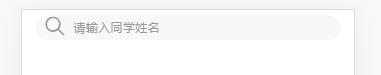
taro h5中想要實現一個樣式如下的輸入框:
問題:
taro組件和taro-ui組件中都沒有這種樣式的組件,taro h5 中還不支持修改placeholder的樣式,自己嘗試著實現一個input組件,更能靈活的定義其中的樣式。
實現
js代碼
import Taro, { Component } from '@tarojs/taro';
import { View } from '@tarojs/components';
import { AtIcon } from 'taro-ui';

import './index.scss';

/**
 * @description 手動實現一個輸入框組件
 * @param placeholder:String 自定義輸入框中的占位符
 * @param onClickSearch:Function 獲取輸入內容回調
 */
class BaseInput extends Component {
  componentDidMount() {
    //輸入框聚焦
    document.querySelector('.search').focus();
  }

  handleSearch = () => {
    //獲取輸入框的內容
    const value = document.querySelector('.search').innerText;
    this.props.onClickSearch && this.props.onClickSearch(value);
  };

  render() {
    const { placeholder = '請輸入' } = this.props;
    return (
      <View className="base_input">
        <View className="my_search">
          <AtIcon
            value="search"
            color="#999"
            className="search_icon"
            onClick={this.handleSearch}
          />
          {/* contenteditable可以控制一個div是否可以編輯 */}
          <View
            className="search"
            contenteditable
            placeholder={placeholder}
          ></View>
        </View>
      </View>
    );
  }
}
export default BaseInput;
scss代碼
.base_input {
  .my_search {
    box-sizing: border-box;
    width: 690px;
    height: 56px;
    line-height: 56px;
    border-radius: 28px;
    margin: 12px auto;
    background: #f8f8f8;
    display: flex;
    .search_icon {
      width: 30px;
      height: 30px;
      margin-left: 20px;
      margin-right: 18px;
    }
    .search {
      width: 560px;
      padding: 0px 18px;
      background: #f8f8f8;
      height: 56px;
      color: #999;
      font-size: 28px;
      font-weight: 400;
      &:empty::after {
        content: attr(placeholder);
      }
    }
  }
}
以上就是本文的全部內容,希望對大傢的學習有所幫助,也希望大傢多多支持WalkonNet。
推薦閱讀:
- React實現二級聯動的方法
- JavaScript仿京東搜索框實例
- JavaScript實現簡易登錄註冊頁面
- js類庫styled-components快速入門教程
- 利用Ajax實現智能回答的機器人示例代碼