R語言條形圖創建方法
條形圖表示矩形條中的數據,條的長度與變量的值成比例。 R語言使用函數 barplot() 創建條形圖。 R 語言可以在條形圖中繪制垂直和水平條。 在條形圖中,每個條可以給予不同的顏色。
語法
在 R 語言中創建條形圖的基本語法是
- H 是包含在條形圖中使用的數值的向量或矩陣。
- xlab 是 x 軸的標簽。
- ylab 是 y 軸的標簽。
- main 是條形圖的標題。
- names.arg 是在每個條下出現的名稱的向量。
- col 用於向圖中的條形提供顏色。
barplot(H, xlab, ylab, main, names.arg, col)
以下是所使用的參數的描述 –
例
使用輸入向量和每個條的名稱創建一個簡單的條形圖。
以下腳本將創建並保存當前 R 語言工作目錄中的條形圖。
# Create the data for the chart.
H <- c(7,12,28,3,41)

# Give the chart file a name.
png(file = "barchart.png")

# Plot the bar chart.
barplot(H)

# Save the file.
dev.off()
當我們執行上面的代碼,它產生以下結果 –

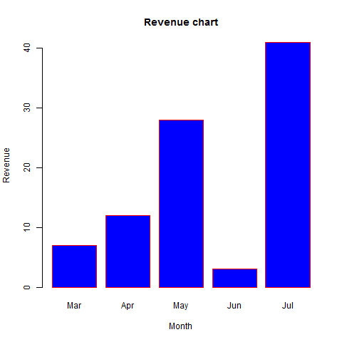
條形圖標簽,標題和顏色
可以通過添加更多參數來擴展條形圖的功能。 主要參數用於添加標題。 col 參數用於向條形添加顏色。 name.args 是具有與輸入向量相同數量的值的向量,以描述每個條的含義。
例
以下腳本將在當前R語言工作目錄中創建並保存條形圖。
# Create the data for the chart.
H <- c(7,12,28,3,41)
M <- c("Mar","Apr","May","Jun","Jul")

# Give the chart file a name.
png(file = "barchart_months_revenue.png")

# Plot the bar chart.
barplot(H,names.arg = M,xlab = "Month",ylab = "Revenue",col = "blue",
main = "Revenue chart",border = "red")

# Save the file.
dev.off()
當我們執行上面的代碼,它產生以下結果 –
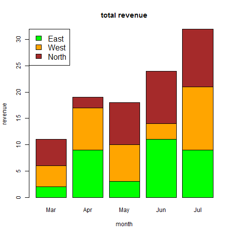
組合條形圖和堆積條形圖
我們可以使用矩陣作為輸入值,在每個條中創建條形圖和堆疊組的條形圖。
超過兩個變量表示為用於創建組合條形圖和堆疊條形圖的矩陣。
# Create the input vectors.
colors <- c("green","orange","brown")
months <- c("Mar","Apr","May","Jun","Jul")
regions <- c("East","West","North")

# Create the matrix of the values.
Values <- matrix(c(2,9,3,11,9,4,8,7,3,12,5,2,8,10,11),nrow = 3,ncol = 5,byrow = TRUE)

# Give the chart file a name.
png(file = "barchart_stacked.png")

# Create the bar chart.
barplot(Values,main = "total revenue",names.arg = months,xlab = "month",ylab = "revenue",
   col = colors)

# Add the legend to the chart.
legend("topleft", regions, cex = 1.3, fill = colors)

# Save the file.
dev.off()
到此這篇關於R語言條形圖創建方法的文章就介紹到這瞭,更多相關R語言條形圖內容請搜索WalkonNet以前的文章或繼續瀏覽下面的相關文章希望大傢以後多多支持WalkonNet!
推薦閱讀:
- None Found