vue-echarts如何實現圖表組件封裝詳解
背景:
需要大量使用圖表的項目,為瞭提升開發效率,可以對圖表類進行封裝成組件,方便頁面的搭建,也能進行統一管理維護,即使後面系統風格需要調整,調整起來也比較方便、快速。
有哪些工具?
常用的有Echarts、AntV,使用起來都大同小異,具體圖表如何實現,看官網參數進行配置調整即可。
怎麼封裝?
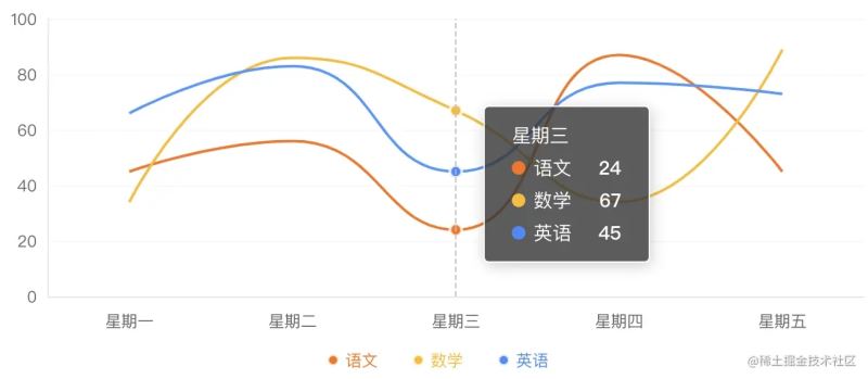
以Echarts為例,效果截圖
- 安裝依賴,安裝vue-echarts需要安裝echarts,vue2下使用vue-echarts還需要安裝@vue/composition-api。
npm install echarts --save
npm install vue-echarts --save
npm install --save @vue/composition-api

// 最終安裝版本
// "echarts": "^5.3.2",
// "vue-echarts": "^6.0.3",
// "@vue/composition-api": "^1.6.1",
- 使用vue-echarts對圖表進行封裝,這裡隻演示line折線圖,常用的柱狀圖bar、餅圖pie等與折線圖line的實現方法相似,更改defaultOption和option對應參數即可。vue-echarts隻需要傳入option配置即可進行圖表更新,配合vue的computed,我們可以根據props進來的數據進行實時計算,從而實現echarts的繪制和數據更新。dataSource為傳進來echarts的數據,包括橫縱坐標的數值和配置參數;chartOption是一些用戶自定義的line參數,可以根據當前圖表的風格對組件做一些參數調整;height控制echart的高度。option的title、tooltip、grid、legend、xAxis、yAxis、series幾個重要參數,使用assign進行整合,如果chartOption有傳自定義的配置參數,則生效自定義配置參數,沒有,則使用默認配置。設置autoresize讓圖表自適應。
<template>
    <v-chart
        ref="myChart"
        class="echarts"
        :style="{height: height}"
        :option="option"
        autoresize
        @click="click"
    />
</template>

<script>
// eslint-disable-next-line no-unused-vars
import echarts from 'echarts'
import VChart from 'vue-echarts'
export default {
  name: 'EchartLine',
  components: {
    VChart
  },
  props: {
    dataSource: {
      type: Object,
      default: () => {
        return {}
      }
    },
    chartOption: {
      type: Object,
      default: () => {
        return {}
      }
    },
    height: {
      type: String,
      default: '340px'
    },
    unit: {
      type: String,
      default: ''
    }
  },
  computed: {
    option () {
      const option = {
        title: _.assign({}, this.defaultOption.title, this.chartOption.title || {}),
        tooltip: _.assign({}, this.defaultOption.tooltip, this.chartOption.tooltip || {}),
        grid: _.assign({}, this.defaultOption.grid, this.chartOption.grid || {}),
        legend: _.assign({}, this.defaultOption.legend, this.chartOption.legend || {}),
        xAxis: _.assign({}, this.defaultOption.xAxis, this.chartOption.xAxis, {data: this.dataSource.xAxis}),
        yAxis: _.assign({}, this.defaultOption.yAxis, this.chartOption.yAxis || {}),
        series: _.map(this.dataSource.yAxis, dataItem => {
          return {
            type: 'line',
            symbol: dataItem.symbol || 'circle',
            smooth: dataItem.smooth !== false,
            symbolSize: dataItem.symbolSize || 8,
            showSymbol: dataItem.showSymbol || (dataItem.data.length === 1),
            name: dataItem.name,
            data: dataItem.data,
            itemStyle: {
              color: dataItem.color,
              borderColor: 'rgba(255,255,255,0.8)',
              borderWidth: 2
            }
          }
        })
      }
      return option
    }
  },
  data () {
    return {
      defaultOption: {
        title: {
          x: '5%'
        },
        tooltip: {
          trigger: 'axis',
          textStyle: {
            color: '#fff'
          },
          backgroundColor: 'rgba(51,51,51,0.80)',
          padding: [14, 20]
        },
        grid: {
          top: '15%',
          left: '24',
          right: '24',
          bottom: '60',
          containLabel: true
        },
        legend: {
          left: 'center',
          bottom: '26',
          itemGap: 25,
          itemWidth: 8,
          itemHeight: 8,
          show: true,
          icon: 'circle',
          textStyle: {
            color: () => {
              return _.map(this.dataSource.yAxis, item => {
                return item.color
              })
            }
          }
        },
        xAxis: {
          axisLabel: {
            margin: 12,
            textStyle: {
              color: '#666'
            }
          },
          axisTick: {
            show: false
          },
          axisLine: {
            lineStyle: {
              color: '#E8E8E8'
            }
          },
          splitLine: {
            show: false
          }
        },
        yAxis: {
          minInterval: 1,
          splitNumber: 5,
          axisLine: {
            show: true,
            lineStyle: {
              color: '#E8E8E8'
            }
          },
          splitLine: {
            show: true,
            lineStyle: {
              color: '#E8E8E8',
              opacity: 0.5,
              type: 'dotted'
            }
          },
          axisTick: {
            show: false
          },
          axisLabel: {
            textStyle: {
              color: '#666'
            }
          }
        }
      }
    }
  },
  methods: {
    click (e) {
      this.$emit('click', e)
    }
  }
}
</script>
<style lang="scss" scoped>
.echarts{
    width: 100%;
    height: 100%;
}
</style>
- 組件使用,配置dataSource即可展示數值,如果想自行定義一些參數配置,可通過chartOption配置實現。
<template>
  <EchartLine :dataSource="dataSource"></EchartLine>
</template>

<script>
import EchartLine from '@/components/EchartLine'
export default {
  name: 'EchartsDemo',
  components: {
    EchartLine
  },
  data () {
    return {
      dataSource: {
        xAxis: ['星期一', '星期二', '星期三', '星期四', '星期五'],
        yAxis: [
          {
            name: '語文',
            color: '#FF6F00',
            data: [45, 56, 24, 87, 45]
          },
          {
            name: '數學',
            color: '#FFB903',
            data: [34, 86, 67, 34, 89]
          },
          {
            name: '英語',
            color: '#3D8BFF',
            data: [66, 83, 45, 77, 73]
          }
        ]
      }
    }
  },
  methods: {
  }
}
</script>
Tips:
vue-echarts資料:github.com/ecomfe/vue-…
echarts v5各參數配置:echarts.apache.org/zh/option.h…
總結
到此這篇關於vue-echarts如何實現圖表組件封裝的文章就介紹到這瞭,更多相關vue-echarts圖表組件封裝內容請搜索WalkonNet以前的文章或繼續瀏覽下面的相關文章希望大傢以後多多支持WalkonNet!