用Vue封裝導航欄組件
前言:把一個功能模塊使用組件化的思想充分封裝,如導航欄,這無論對我們的開發思想還是效率都有許多好處,在開發中,我們要盡量多得運用組件化的開發思想,不要把所有代碼都寫在同一個.vue文件中,這樣能大大提高代碼的可讀性。
封裝導航欄
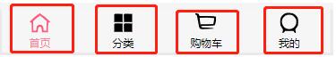
主要思路:把紅色的部分當成一個個組件,而他們隻是圖片和文字不同,所以我們可以把他們封裝成同一個組件,然後向組件裡傳入圖片信息和文字信息即可(可以用插槽)。
//TabBarItem.vue
<template>
  <div class="tabBarItem" @click="tabBarItemClick">
    <div v-if="!isActive">
      <slot name="item-icon"></slot>
    </div>
    <div v-else>
      <slot name="item-icon-active"></slot>
    </div>
    <div :style="isActiveColor">
      <slot name="item-text"></slot>
    </div>
  </div>
</template>

<script>
export default {
  name:"TabBarItem",
  props:{
    path:String,
    activeColor:{
      type:String,
      default:"pink"
    }
  },
  computed:{
    isActive:{
      get(){
        return this.$route.path.indexOf(this.path)!==-1;
      },
      set(){}
    },
    isActiveColor(){
      return this.isActive?{color:this.activeColor}:{}
    }
  },
  methods:{
    tabBarItemClick(){
      this.$router.push(this.path);
    }
  }
}
</script>

<style scoped>
.tabBarItem{
  flex: 1;
  font-size: 12px;
}
.tabBarItem img{
  margin-top: 3px;
  width: 24px;
  padding-bottom:3px ;
}
</style>
接下來就是封裝一個把這4個選項放在同一個地方的容器。
//TabBar.vue
<template>
  <div class="tabBar">
    <slot></slot>
  </div>
</template>

<script>
export default {
  name:"TabBar"
}
</script>

<style scoped>
.tabBar{
  display: flex;
  height: 49px;
  position: fixed;
  left: 0;
  right: 0;
  bottom: 0;
  text-align: center;
  box-shadow: 0px -1px 1px rgba(100, 100, 100, .1);
  background-color: #f6f6f6;
}

</style>
再接下來就是使用瞭,給每一個不同的TabBarItem的插槽寫入不同的圖片和文字信息。
//MainTabBar.vue
<template>
  <div class="mainTabBar">
    <tab-bar>
      <tab-bar-item path="/home" activeColor="#ff8198">
        <img src="~assets/img/tabbar/home.svg" alt="" slot="item-icon">
        <img src="~assets/img/tabbar/home_active.svg" alt="" slot="item-icon-active">
        <div slot="item-text">首頁</div>
      </tab-bar-item>
      <tab-bar-item path="/category" activeColor="#ff8198">
        <img src="~assets/img/tabbar/category.svg" alt="" slot="item-icon">
        <img src="~assets/img/tabbar/category_active.svg" alt="" slot="item-icon-active">
        <div slot="item-text">分類</div>
      </tab-bar-item>
      <tab-bar-item path="/cart" activeColor="#ff8198">
        <img src="~assets/img/tabbar/shopcart.svg" alt="" slot="item-icon">
        <img src="~assets/img/tabbar/shopcart_active.svg" alt="" slot="item-icon-active">
        <div slot="item-text">購物車</div>
      </tab-bar-item>
      <tab-bar-item path="/profile" activeColor="#ff8198">
        <img src="~assets/img/tabbar/profile.svg" alt="" slot="item-icon">
        <img src="~assets/img/tabbar/profile_active.svg" alt="" slot="item-icon-active">
        <div slot="item-text">我的</div>
      </tab-bar-item>
    </tab-bar>
  </div>
</template>

<script>
import TabBar from "components/common/tabbar/TabBar"
import TabBarItem from "components/content/tabbar/TabBarItem"
export default {
  name:"MainTabBar",
  components:{
    TabBar,
    TabBarItem
  }
}

</script>
<style>

</style>
導航欄一般都在主頁中使用,所以我們把這個導航欄放在App.vue
<template>
  <div id="app">
    <main-tab-bar></main-tab-bar>
  </div>
</template>

<script>
import MainTabBar from "components/content/tabbar/MainTabBar";
export default {
  name: 'App',
  components:{
    MainTabBar
  }
}
總結:這樣看來,我們寫一個導航欄用瞭3個文件,這可能看起來是麻煩的,但這也大大提高瞭代碼的可讀性,如果我們還需要在該項目別的地方使用導航欄,我們隻需要直接創建一個MainTabBar類似的文件,然後把你要的圖片和文字寫進入即可,甚至於在別的項目用到時,我們可以直接將文件拷貝過去就能夠直接使用,連CSS樣式都不需要我們去寫,這就大大提高瞭我們的開發效率。
以上就是本文的全部內容,希望對大傢的學習有所幫助,也希望大傢多多支持WalkonNet。
推薦閱讀:
- VantUI封裝自定義Tabbar路由跳轉的實現
- vue實現多級側邊欄的封裝
- vue.js使用Element-ui中實現導航菜單
- Vue實現路由嵌套的方法實例
- vue+quasar使用遞歸實現動態多級菜單