Android Compose實現底部按鈕以及首頁內容詳細過程第1/2頁
前言
compose作為Android現在主推的UI框架,各種文章鋪天蓋地的席卷而來,作為一名Android開發人員也是很有必要的學習一下瞭,這裡就使用wanandroid的開放api來編寫一個compose版本的玩安卓客戶端,全當是學習瞭,各位大佬輕噴~
先來看一下首頁的效果圖:

從圖片中可以看到首頁的內容主要分為三部分,頭部標題欄,banner,數據列表,底部導航欄;今天就實現這幾個功能。
Column、Row、ConstraintLayout佈局先知
在Compose佈局中主要常用的就是這三個佈局,分別代表縱向排列佈局,橫向排列佈局,以及約束佈局;先大概瞭解一下用法,以及佈局包裹內部元素的排列方便在項目中更好的使用。
Column縱向排列佈局
Column主要是將佈局包裹內的元素由上至下垂直排列顯示,類似於Recyclerview的item,簡單來看一段代碼:
@Preview
@Composable
fun ColumnItems(){
    Column {
        Text(text = "我是第一個Column元素",Modifier.background(Color.Gray))
        Text(text = "我是第二個Column元素",Modifier.background(Color.Green))
        Text(text = "我是第三個Column元素",Modifier.background(Color.LightGray))
    }
}
可以看到在一個Column裡面包裹瞭三個Text,那麼來看一下效果:
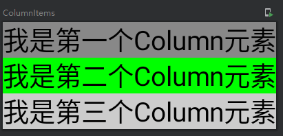
可以看到所有元素是由上至下進行排列的。
Row橫向排列佈局
簡而言之就是將佈局裡面的元素一個一個的由左到右橫向排列。
再來看一段簡短的代碼:
@Preview
@Composable
fun RowItems(){
    Row {
        Text(text = "我是第一個Row元素",Modifier.background(Color.Gray).height(100.dp))
        Text(text = "我是第二個Row元素",Modifier.background(Color.Green).height(100.dp))
        Text(text = "我是第三個Row元素",Modifier.background(Color.LightGray).height(100.dp))
    }
}
在Row裡面同樣包裹瞭三個Text文本,再來看一下效果:
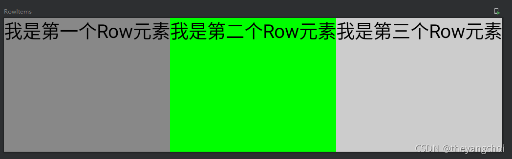
可以看到Row裡面的元素是由左到右橫向進行排列的。
ConstraintLayout 約束佈局
在compose裡面同樣可以使用約束佈局,主要主用於一些Column或者Row或者Box佈局無法直接實現的佈局,在實現更大的佈局以及有許多復雜對齊要求以及佈局嵌套過深的場景下,ConstraintLayout 用起來更加順手,在使用ConstraintLayout 之前需要先導入相關依賴包:
implementation "androidx.constraintlayout:constraintlayout-compose:1.0.0-rc01"
這裡額外提一句,在你創建項目的時候所有compose的相關依賴包都要和你項目當前的compose版本一致,或者都更新到最新版,如果compose的版本大於你現在導入的其他依賴庫的版本,那麼就會報錯。
在使用ConstraintLayout需要註意以下幾點:
- 聲明元素 通過 createRefs() 或 createRef() 方法初始化聲明的,並且每個子元素都會關聯一個ConstraintLayout 中的 Composable 組件;
- 關聯組件 Modifier.constrainAs(text)通過constrainAs關聯組件
- 約束關系可以使用 linkTo 或其他約束方法實現;
- parent 是一個默認存在的引用,代表 ConstraintLayout 父佈局本身,也是用於子元素的約束關聯。
來看一段代碼:
@Preview
@Composable
fun ConstraintLayoutDemo(){
    ConstraintLayout {
        //聲明元素
        val (text,text2,text3) = createRefs()

        Text(text = "我是第一個元素",Modifier.height(50.dp).constrainAs(text){
            //將第一個元素固定到父佈局的右邊
            end.linkTo(parent.end)
        })
        Text(text = "老二",modifier = Modifier.background(Color.Green).constrainAs(text2){
            //將第二個元素定位到第一個元素的底部
            top.linkTo(text.bottom)
            //,然後於第一個元素居中
            centerTo(text)
        })
        Text(text = "老三",modifier = Modifier.constrainAs(text3){
            //將第三個元素定位到第二個元素的底部
            top.linkTo(text2.bottom)
            //將第三個元素定位在第二個元素的右邊
            start.linkTo(text2.end)
        })
    }
}
看一下效果:

約束佈局隻要習慣linkTo的使用就能很好的使用該佈局。
Modifier的簡單使用
Modifier在compose裡面可以設置元素的寬高,大小,背景色,邊框,邊距等屬性;這裡隻介紹一些簡單的用法。
先看一段代碼:
modifier = Modifier
//            .fillMaxSize()//橫向  縱向 都鋪滿,設置瞭fillMaxSize就不需要設置fillMaxHeight和fillMaxWidth瞭
//            .fillMaxHeight()//fillMaxHeight縱向鋪滿
            .fillMaxWidth()//fillMaxWidth()橫向鋪滿  match
            .padding(8.dp)//外邊距 vertical = 8.dp 上下有8dp的邊距;  horizontal = 8.dp 水平有8dp的邊距
            .padding(8.dp)//內邊距  padding(8.dp)=.padding(8.dp,8.dp,8.dp,8.dp)左上右下都有8dp的邊距
//            .width(100.dp)//寬100dp
//            .height(100.dp)//高100dp
            .size(100.dp)//寬高 100dp
//            .widthIn(min: Dp = Dp.Unspecified, max: Dp = Dp.Unspecified)//設置自身的最小和最大寬度(當子級元素超過自身時,子級元素超出部分依舊可見);
            .background(Color.Green)//背景顏色
            .border(1.dp, Color.Gray,shape = RoundedCornerShape(20.dp))//邊框
- fillMaxSize 設置佈局縱向橫向都鋪滿
- fillMaxHeight 設置佈局鋪滿縱向
- fillMaxWidth 設置佈局鋪滿橫向,這三個屬性再使用瞭fillMaxSize 就沒必要在設置下面兩個瞭
- padding 設置邊距,方向由左上右下設置,添加瞭vertical就是設置垂直的上下邊距,horizontal設置瞭水平的左右邊距。這裡註意寫瞭兩個padding,第一個是外邊距,第二個是內邊距,外邊距最好是放在Modifier的第一個元素。
- width 設置元素的寬
- height 設置元素的高
- size 設置元素大小,隻有一個值時寬高都是一個值,.size(100.dp,200.dp)兩個值前者是寬,後者是高
- widthIn 設置自身的最小和最大寬度(當子級元素超過自身時,子級元素超出部分依舊可見)
- background 設置元素的背景顏色
- border 設置邊框,參數值:邊框大小,邊框顏色,shape
更多Modifier的設置可以查看源碼或者官方文檔。
底部導航欄的實現
從圖中可以可以出,底部導航欄主要包含四個tab,分別是首頁、項目、分類以及我的,而每個tab又分別包含一張圖片和一個文字。

具體實現步驟:
1.編寫每個tab的樣式,這裡要使用到Column進行佈局,Column列的意思,就是Column裡面的元素會一個順著一個往下排的意思,所以我們需要在裡面放一個圖片Icon和一個文本Text。
Column(
   modifier.padding(vertical = 8.dp),//垂直(上下邊距)8dp
   horizontalAlignment = Alignment.CenterHorizontally) {//對齊方式水平居中
   Icon(painter = painterResource(id = iconId),//圖片資源
        contentDescription = tabName,//描述
        //圖片大小						//顏色
        modifier = Modifier.size(24.dp),tint = tint)
        //      文本			字體大小			字體顏色
   Text(text = tabName,fontSize = 11.sp,color = tint)
}
因為是四個按鈕,並且有著選中和未選中的狀態,所以我們需要封裝成一個方法進行使用:
/**
 * 參數解析
 * @DrawableRes iconId: Int
 *
 * iconId  參數名稱
 * Int     參數類型
 * @DrawableRes 隻能填入符合當前屬性的值
 * */
@Composable
private fun TabItem(@DrawableRes iconId: Int, //tab 圖標資源
                    tabName: String,//tab 名稱
                    tint: Color,//tab 顏色(選中或者未選中狀態)
                    modifier: Modifier = Modifier
){
    Column(
        modifier.padding(vertical = 8.dp),
        horizontalAlignment = Alignment.CenterHorizontally) {
        Icon(painter = painterResource(id = iconId),
            contentDescription = tabName,
            modifier = Modifier.size(24.dp),tint = tint)
        Text(text = tabName,fontSize = 11.sp,color = tint)
    }
}
2.使用Row放置四個TabItem,Row水平排列的意思。
@Composable
fun BottomBar(modifier: Modifier = Modifier, content: @Composable RowScope.() -> Unit) {
    Row(
        modifier
            .fillMaxWidth()
            .background(ComposeUIDemoTheme.colors.bottomBar)
            .padding(4.dp, 0.dp)
            .navigationBarsPadding(),
        content = content
    )
}
@Composable
fun BottomTabBar(selectedPosition: Int, currentChanged: (Int) -> Unit){
	//使用Row將四個TabItem包裹起來,讓它們水平排列
    BottomBar() {
        TabItem(
            iconId = if (selectedPosition == 0) R.drawable.home_selected else R.drawable.home_unselected,
            tabName = "首頁",
            tint = if (selectedPosition == 0) ComposeUIDemoTheme.colors.iconCurrent else ComposeUIDemoTheme.colors.icon,
            Modifier
                .clickable {
                    currentChanged(0)
                }
                .weight(1f))
        TabItem(
            iconId = if (selectedPosition == 1) R.drawable.project_selected else R.drawable.project_unselected,
            tabName = "項目",
            tint = if (selectedPosition == 1) ComposeUIDemoTheme.colors.iconCurrent else ComposeUIDemoTheme.colors.icon,
            Modifier
                .clickable {
                    currentChanged(1)
                }
                .weight(1f))
        TabItem(
            iconId = if (selectedPosition == 2) R.drawable.classic_selected else R.drawable.classic_unselected,
            tabName = "分類",
            tint = if (selectedPosition == 2) ComposeUIDemoTheme.colors.iconCurrent else ComposeUIDemoTheme.colors.icon,
            Modifier
                .clickable {
                    currentChanged(2)
                }
                .weight(1f))
        TabItem(iconId = if (selectedPosition == 3) R.drawable.mine_selected else R.drawable.mine_unselected,
            tabName = "我的",
            tint = if (selectedPosition == 3) ComposeUIDemoTheme.colors.iconCurrent else ComposeUIDemoTheme.colors.icon,
            Modifier
                .clickable {
                    currentChanged(3)
                }
                .weight(1f))
    }
}
TabItem填充解析:
- iconId tab圖標資源,當選中的下標等於當前tab的下標時顯示選中的資源,否則顯示非選中資源
- tabName tab文本
- tint tab 顏色,同樣分為選中和未選中
- Modifier 使用Modifier設置點擊事件,以及權重
- currentChanged(0) tabitem的點擊事件,返回當前item的下標
TabItem(
   iconId = if (selectedPosition == 0) R.drawable.home_selected elseR.drawable.home_unselected,
   tabName = "首頁",
   tint = if (selectedPosition == 0) ComposeUIDemoTheme.colors.iconCurrent else ComposeUIDemoTheme.colors.icon,
   Modifier
        .clickable {
             currentChanged(0)
        }
        .weight(1f))
3.分別創建HomePage、ProjectPage、ClassicPage和MinePage四個頁面,頁面編寫一些簡單的代碼鋪滿頁面即可。
@Composable
fun ClassicPage(viewModel: BottomTabBarViewModel = viewModel()){
    Column(Modifier.fillMaxWidth()) {
        DemoTopBar(title = "分類")
        Box(
            Modifier
                .background(ComposeUIDemoTheme.colors.background)
                //使用Modifier將頁面鋪滿
                .fillMaxSize()
        ) {
            Text(text = "分類")
        }
    }
}
4.使用HorizontalPager進行頁面滑動,並且與tabitem的點擊事件進行綁定,達到頁面滑動切換以及點擊tabitem進行切換的效果。
HorizontalPager主要參數解析:
- count 總頁面數
- state 當前選中的頁面狀態
使用HorizontalPager需要導入以下資源:
implementation "com.google.accompanist:accompanist-pager:$accompanist_pager"//0.20.2
具體實現步驟如下:
先通過remember記錄住當前選中的下標,這個主要作用與tabItem的切換
//記錄頁面狀態
val indexState = remember { mutableStateOf(0) }
然後通過rememberPagerState記錄HorizontalPager的currentPager也就是當前頁面下標
val pagerState = rememberPagerState()
使用HorizontalPager填充頁面
HorizontalPager(count = 4,
   state = pagerState,
   modifier = Modifier.fillMaxSize().weight(1f))
    { page: Int ->
         when(page){
             0 ->{
             	HomePage()
             }
             1 ->{
                ProjectPage()
             }
             2 ->{
                ClassicPage()
             }
             3 ->{
                 MinePage()
             }
     }
}
使用LaunchedEffect進行頁面切換
//頁面切換
LaunchedEffect(key1 = indexState.value, block = {
      pagerState.scrollToPage(indexState.value)
})
最後綁定底部導航欄並綁定點擊事件
//滑動綁定底部菜單欄
/**
selectedPosition = pagerState.currentPage
將當前的currentPager賦值給tabitem的selectPosition對底部導航欄進行綁定

indexState.value = it
將底部導航欄的點擊回調下標賦值給indexState對pager進行綁定
*/
BottomTabBar(selectedPosition = pagerState.currentPage){
       indexState.value = it
}
到這裡就能實現一個底部導航欄以及四個頁面的切換瞭。
首頁內容的實現
Banner的實現
因為獲取Banner數據要進行網絡請求,至於網絡封裝就不貼代碼瞭,這裡直接從ViewModel開始展示,具體的網絡代碼可以移步到項目進行觀看。
首頁ViewModel
主要用於Banner和首頁文章列表的網絡請求:
class HomeViewModel : ViewModel() {
    private var _bannerList = MutableLiveData(listOf<BannerEntity>())
    val bannerList:MutableLiveData<List<BannerEntity>>  = _bannerList

    fun getBannerList(){
        NetWork.service.getHomeBanner().enqueue(object : Callback<BaseResult<List<BannerEntity>>>{
            override fun onResponse(call: Call<BaseResult<List<BannerEntity>>>,response: Response<BaseResult<List<BannerEntity>>>) {
                response.body()?.let {
                    _bannerList.value = it.data
                }
            }

            override fun onFailure(call: Call<BaseResult<List<BannerEntity>>>, t: Throwable) {
            }
        })
    }

    private var _articleData = MutableLiveData<ArticleEntityPage>()
    val articleData:MutableLiveData<ArticleEntityPage> = _articleData

    fun getArticleData(){
        NetWork.service.getArticleList().enqueue(object : Callback<BaseResult<ArticleEntityPage>>{
            override fun onResponse(call: Call<BaseResult<ArticleEntityPage>>,response: Response<BaseResult<ArticleEntityPage>>) {
                response.body()?.let {
                    articleData.value = it.data
                }
            }

            override fun onFailure(call: Call<BaseResult<ArticleEntityPage>>, t: Throwable) {
            }
        })
    }
}
在調用HomePage的時候將HomeViewModel傳入進去,不推薦直接在compose裡面直接調用,會重復調用:
val bVM = HomeViewModel()
HomePage(bVM = bVM)
HomePage的創建:
fun HomePage(viewModel: BottomTabBarViewModel = viewModel(), bVM:HomeViewModel){
}
數據調用進行請求,首先要創建變量通過observeAsState進行數據接收刷新
val bannerList by bVM.bannerList.observeAsState()
Compose的網絡請求要放到LaunchedEffect去執行,才不會重復請求數據
val requestState = remember { mutableStateOf("") }
LaunchedEffect(key1 = requestState.value, block = {
   bVM.getBannerList()
})
繪制Banner的View,這裡同樣使用到HorizontalPager,並且還使用瞭coil進行網絡加載,需要導入相關依賴包
implementation 'io.coil-kt:coil-compose:1.3.0'
BannerView的代碼,實現大致和tabitem差不多,隻是添加瞭一個輪播,就不做過多的極細,直接貼代碼瞭
@ExperimentalCoilApi
@ExperimentalPagerApi
@Composable
fun BannerView(bannerList: List<BannerEntity>,timeMillis:Long){
Box(
Modifier
.fillMaxWidth()
.height(160.dp)) {val pagerState = rememberPagerState()
var executeChangePage by remember { mutableStateOf(false) }
var currentPageIndex = 0HorizontalPager(count = bannerList.size,
state = pagerState,
modifier = Modifier
.pointerInput(pagerState.currentPage) {
awaitPointerEventScope {
while (true) {
val event = awaitPointerEvent(PointerEventPass.Initial)
val dragEvent = event.changes.firstOrNull()
when {
dragEvent!!.positionChangeConsumed() -> {
return@awaitPointerEventScope
}
dragEvent.changedToDownIgnoreConsumed() -> {
//記錄下當前的頁面索引值
currentPageIndex = pagerState.currentPage
}
dragEvent.changedToUpIgnoreConsumed() -> {
if (pagerState.targetPage == null) return@awaitPointerEventScope
if (currentPageIndex == pagerState.currentPage && pagerState.pageCount > 1) {
executeChangePage = !executeChangePage
}
}
}
}
}
}
.clickable {
Log.e(
"bannerTAG",
"點擊的banner item:${pagerState.currentPage} itemUrl:${bannerList[pagerState.currentPage].imagePath}"
)
}
.fillMaxSize()) { page ->
Image(
painter = rememberImagePainter(bannerList12下一頁閱讀全文推薦閱讀:
- Jetpack Compose實現列表和動畫效果詳解
- Jetpack Compose佈局的使用詳細介紹
- Android Jetpack Compose實現列表吸頂效果
- Android開發Compose remember原理解析
- Jetpack Compose實現動畫效果的方法詳解