微信小程序開發之全局配置與頁面配置實現
一、全局配置
app.json文件就是項目的全局配置文件

(1)小程序窗口的組成部分

(2)導航欄 navigationBar
1)window節點常用配置項

2)設置導航欄
設置導航欄標題文字
app.json–>window–>navigationBarTitleText
設置導航欄背景色
app.json–>window–>navigationBarBackgroundColor
設置導航欄的標題顏色
app.json–>window–>navigationBarTextStyle
app.json文件中window節點代碼
 "window":{
    "backgroundTextStyle":"light",
    "navigationBarBackgroundColor": "#13227a",
    "navigationBarTitleText": "Hello",
    "navigationBarTextStyle":"white"
  },

(3)下拉刷新頁面
1)概念
下拉刷新是移動端的轉有名詞,指的是通過手指在屏幕上的下拉滑動操作,從而重新加載頁面數據的行為
2)設置下拉刷新 開啟下拉刷新
app.json–>window–>enablePullDownRefresh–>true
設置下拉刷新時窗口的背景色
app.json–>window–>backgroundColor–>指定十六進制的顏色值#efefef
設置下拉刷新時loading樣式
app.json–>window–>backgroundTextStyle–>dark
"window":{
    "navigationBarBackgroundColor": "#13227a",
    "navigationBarTitleText": "Hello",
    "navigationBarTextStyle":"white",
    "enablePullDownRefresh": true,
    "backgroundColor": "#efefef",
    "backgroundTextStyle":"dark"
  },

(4)上拉觸底的距離
1)概念
上拉觸底是移動端的專有名詞,通過手指在屏幕上的上拉滑動操作,從而加載更多數據的行為
2)設置
app.json–>window–>onReachBottomDistance–>設置新值
註意:小程序默認觸底距離為50px,若沒有特殊的需求,那麼直接使用默認值即可
(5)底部導航欄 tabBar
1)概念
tabBar是移動端應用常見的頁面效果,用於實現多頁面的快速切換
小程序中tabBar分為兩類
- 底部tabBat(常用)
- 頂部tabBar
註意點
- tabBar中隻能配置最少2個、最多5個tab頁簽
- 當渲染頂部tabBar時,不顯示icon圖標,隻顯示文本
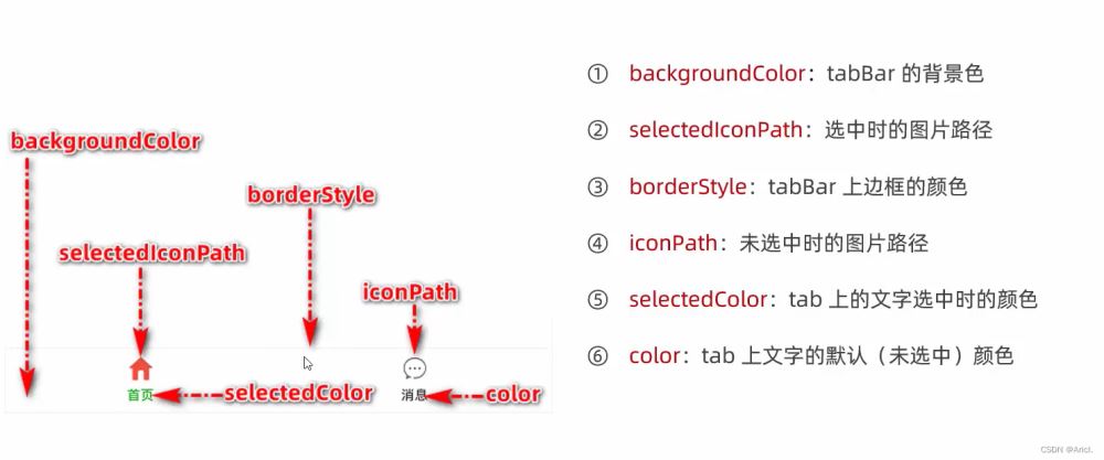
tabBar的6個組成部分
2)tabBar節點配置項

3)每個tab項的配置選項

4)示例

app.json文件中tabBar節點代碼
"tabBar": {
    "list": [{
      "pagePath": "pages/index/index",
      "text": "首頁",
      "iconPath": "images/home.png",
      "selectedIconPath": "images/home-active.png"
    },
    {
      "pagePath": "pages/message/message",
      "text": "消息",
      "iconPath": "images/message.png",
      "selectedIconPath": "images/message-active.png"
    },
    {
      "pagePath": "pages/contract/contract",
      "text": "聯系我們",
      "iconPath": "images/contract.png",
      "selectedIconPath": "images/contract-active.png"
    }
  ]
  },

註意事項
- 可以先在項目的根目錄下新建image文件夾,來專門存儲項目需要使用到的icon圖標
- 作為tabBar的頁面必須放在app.json文件中Pages節點的前面,否則無法正常跳轉(切記)
(6)圖標的獲取
博主極力推薦阿裡巴巴圖庫矢量網,免費,且圖標豐富,真的很良心的一個實用網站!

二、頁面配置
(1)概念
小程序中,每一個頁面都有一個屬於自己的.json頁面配置文件,用來對當前頁面的窗口外觀、頁面效果等進行特定的配置
(2)頁面配置與全局配置的關系
- app.json中的window節點,可以全局配置小程序中每一個頁面的窗口表現
- 若某個頁面想要特殊的窗口外觀表現,就可以使用頁面級別的.json配置文本進行配置
- 當全局配置與頁面配置沖突時,根據“ 就近原則 ”,會以頁面配置為準從而覆蓋掉全局配置
(3)常用配置項

配置方法與全局配置同理,不再展示。
三、綜合案例
本案例是本地生活小程序首頁界面的初步實現
(1)步驟
- 先配置導航欄效果
- 配置底部tabBar效果
- 實現頂部的輪播圖
- 實現九宮格功能框
- 實現底部圖片佈局
(2)真機調試效果圖

(3) 完整代碼 js文件
// index.js
Page({
  data: {
        image: [{path:"/images/food.png",name:"吃美食"},{path:"/images/wash.png",name:"約洗浴"},{path:"/images/marry.png",name:"結婚啦"},{path:"/images/KTV.png",name:"去唱歌"},{path:"/images/work.png",name:"找工作"},{path:"/images/teacher.png",name:"報輔導"},{path:"/images/car.png",name:"養汽車"},{path:"/images/hotel.png",name:"定酒店"},{path:"/images/fush.png",name:"找裝修"}],
  },
  onLoad:function(options) {
     console.log(options)
  }
})
(圖片路徑需自定義)
json文件
{
  "usingComponents": {
    "mt-test1":"/components/test/test1"
  },
  "enablePullDownRefresh": true,
  "backgroundColor": "#efefef",
  "backgroundTextStyle": "dark"
}
wxml文件
<!-- 首頁頂部的輪播圖效果 -->
<swiper indicator-dots indicator-color="white" circular autoplay >
        <swiper-item>
           <image src="/images/locallife.png" ></image>
        </swiper-item>
        <swiper-item>
           <image src="/images/locallife2.png"></image>
        </swiper-item>
        <swiper-item>
            <image src="/images/locallife3.png"></image>
        </swiper-item>
</swiper>

<!-- 九宮格功能區 -->
<!-- 外層容器 -->
<view class="gridList">
      <!-- 內層容器 -->
      <navigator class="gridItem" wx:for="{{image}}" url="/pages/shoplist/shoplist?title={{item.name}}">
            <image src="{{item.path}}"></image>
            <text>{{item.name}}</text>
      </navigator>
</view>

<!-- 底部圖片功能塊 -->
<view class="img-box">
     <image src="/images/tuijian.png" mode="widthFix"></image>
     <image src="/images/pingjia.png" mode="widthFix"></image>
</view>
wxss文件
swiper {
  height: 400rpx;
}
swiper image{
  width: 100%;
  height: 100%;
}

.gridList{
  /* flex佈局格式 */
  display: flex;
  /* 允許自動換行 */
  flex-wrap: wrap;
  /* 給外層容器左邊與上部加上邊框線 */
  border-left: 1rpx solid #efefef;
  border-top:  1rpx solid #efefef;
}

.gridItem{
  width: 33.33%;
  /* 每個圖片的固定高度 */
  height: 200rpx;
  display: flex;
  flex-direction: column;
  align-items: center;
  justify-content: center;
  /* 給內層容器中的每一項加上右側和底部的邊框線 */
  border-right: 1rpx solid #efefef;
  border-bottom: 1rpx solid #efefef;
  /* 改變盒子的方式為border-box */
  box-sizing: border-box;

}

.gridItem image{
  width: 60rpx;
  height: 60rpx;
}

.gridItem text{
  font-size: 24rpx;
  /* 設置文本與圖片的上部距離 */
  margin-top: 10rpx;
}

.img-box{
  display: flex;
  padding: 20rpx 10rpx;
  justify-content: space-around;
}
.img-box image{
  width: 45%;
}
到此這篇關於微信小程序開發之全局配置與頁面配置實現的文章就介紹到這瞭,更多相關小程序全局配置與頁面配置內容請搜索WalkonNet以前的文章或繼續瀏覽下面的相關文章希望大傢以後多多支持WalkonNet!
推薦閱讀:
- 微信小程序swiper輪播圖組件使用方法詳解
- 微信小程序的宿主環境實現代碼
- 微信小程序全局配置之tabBar實戰案例
- uniapp五分鐘實現刷抖音小程序教程示例
- 微信小程序如何設置基本的頁面樣式,做出用戶界面UI